Thursday 30 April 2020
Art Skills – Visual Analysis
Following on from our Collection Focus articles, our volunteer Madeleine has written a guide to visual analysis, so you can learn how to analyse the components of an artwork and gain a greater understanding of the artist’s ideas and perspective.
A Beginner’s Guide to Visual Analysis: What Are You Looking At?
What is Visual Analysis?
Visual analysis, also called ‘formal analysis’, is the analysis of a work of art, sculpture or piece of architecture. It is the foundation of any art historical writing and makes up the backbone of art history. Visual analysis is the thorough observation of the formal elements (‘formal’ referring to the visual elements that make up the whole form of the artwork in question) and characteristics of a piece of artwork. The formal elements which need to be considered when performing a visual analysis of an artwork include; line, colour (light and tone), scale, composition and space, medium, techniques, and size of the artwork and lastly, function. To further the analysis, historical context and interpretations of meaning can also be welcomed into the discussion.
What is the Purpose of Visual Analysis?
The core purpose of visual analysis is to recognise and understand the visual choices the artist made in creating the artwork. The result of a close visual analysis is the better understanding what exactly the viewer is looking at and what the artist intended to convey. Ultimately, by noting down separate parts of the entirety of the work, the aim of the exercise is to better understand the work as a whole. Undertaking visual analyses regularly can also help to understand visual advertising, such as billboards and adverts in magazines. You can start to pick apart what makes the advert effective and what hinders its efficacy.
Never Underestimate the Basics
For the purpose of this guide, I will be illustrating how to perform a visual analysis on paintings, the most common medium for the formal art historical analysis. However, the discussed elements can be practised and applied to any medium of artwork.
Now, this may sound obvious, but a great starting point for your visual analysis always lies within the sheer basics of the piece of artwork; the painter, the subject and the contemporary audience. You can learn a lot from the information readily available to you and this general information can serve as a perfect introduction to a formal analysis paper and is equally important in creating a better understanding of the artist and his/her work in question to a detailed analysis of the piece’s formal elements.
Personally, I believe it is key to initially propose and answer these six questions before conducting the detailed process of analysing a piece of art.
- Who is the artist? What genre of art do they belong to?
- What is the painter’s purpose?
- When and where was the artwork created?
- What is the subject matter?
- Who is the desired audience?
- What is the historical context behind the painting?
Initially familiarising yourself with these six essential points will give you all the basic information you need to begin a full detailed visual analysis of a piece of artwork. Using the above questions as starting points for your discussion, you will find other questions are proposed which can be answered when you move onto the detailed analysis. It is important to understand that without your introductory ‘basic’ knowledge, a full visual analysis of the relationship between image and viewer, how and why the image and its creation affects the viewer, cannot be achieved. For example, without knowing the date and provenance of an artwork, it becomes a much longer process in placing the piece within a genre of art.
Performing a Visual Analysis: What to Look For
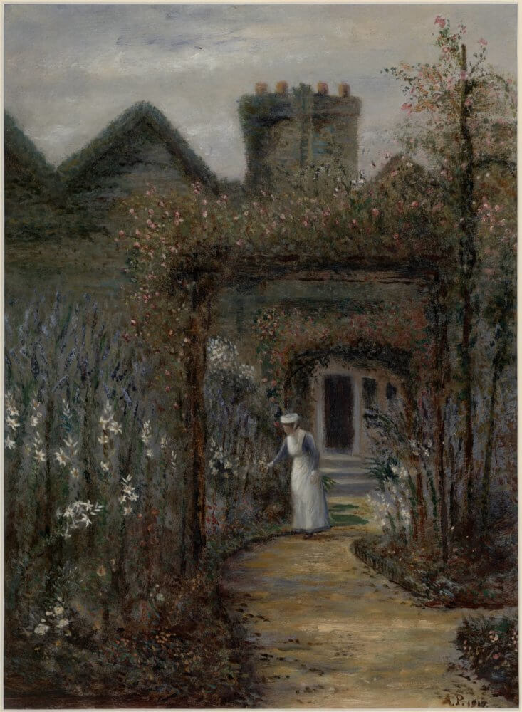
As previously touched upon, the elements that comprise a visual analysis are materials, techniques, processes and form and style. It is crucial to understand these formal elements in order to respond and analyse them. To help me explain a handful of the formal elements you should consider when conducting your visual analysis, I will be referring to a beautiful painting in the Richmond Borough Art Collection by Mrs A. Perodean, Sister Agnes in the garden of St. John’s Hospital Twickenham, 1917.
Line – The most basic formal element, ‘line’ corresponds to how figures and shapes are defined. ‘Line’ is often used and manipulated to convey motion or emotion. As you can see from Perodean’s work, the shapes, objects and even the figure of the nurse, who is the focal point of the painting, are not clearly defined. Whilst they are not blurred, they gently diffuse into the canvas.
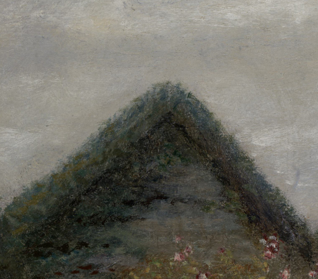
Colour (Light and Tone) – This is a self-explanatory element, the primary question here should be what colours do you see on the canvas? Some other questions included; are the colours bright or subdued? Is there a dominant colour within the artwork? Are the complementary colours juxtaposed? However, to push your analysis further you need to be asking yourself how the artist has manipulated the light. Is there a light source? Is the source inside or outside the frame? Are there contrasts of light (‘chiaroscuro’) and is there a purpose to this? Using Sister Agnes in the garden of St. John’s Hospital, the colours are muted and the dominant colours are dark greys, greens and blues. The figure in Perodean’s work is highlighted as the focal point through the white on her nursing apron. Perodean’s choice of colours here alongside the diffusing lines help to create a hazy atmosphere, as if the fog or the storm has just begun to clear.
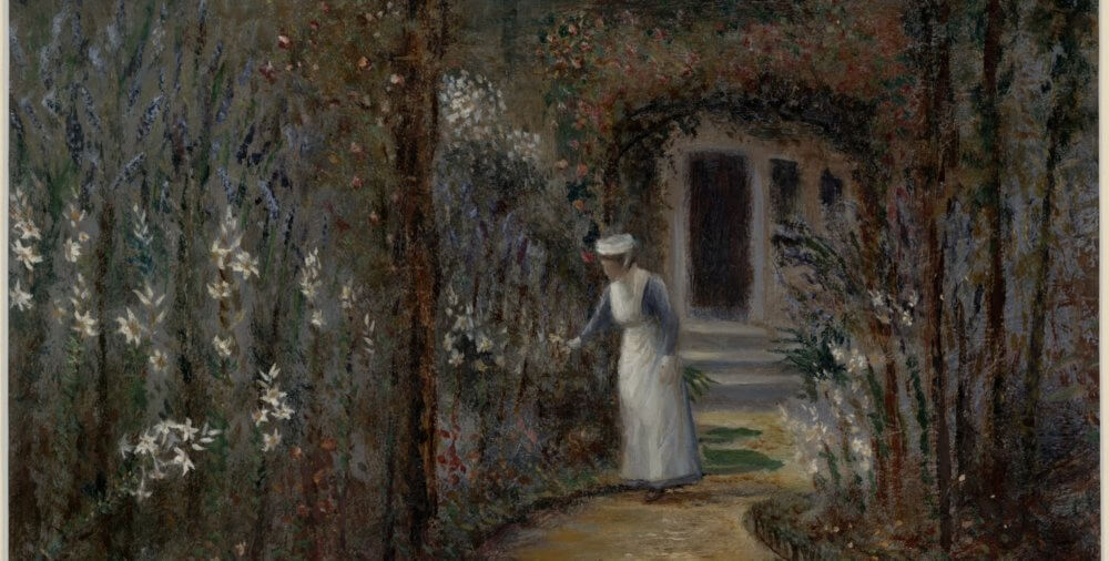
Scale – Here, scale relates to the scale of figures or objects in relation to the total subject matter. A key question here would be: does the scale of the figures suggest their lesser or more significant importance within the artwork? In the case of St Agnes in the garden of St. John’s Hospital, the figure, Sister Agnes, is incredibly minute in relation to the objects around her. However, I would argue that her significance is not measured by her size. As the title suggests, she is the focal point of the piece simply by being Sister Agnes. The white on her apron also helps to draw the viewer’s eye towards her.
Composition – ‘Composition’ is the arrangement of every element within the work of art. These are carefully arranged by the artist with the aim of creating a relationship between the forms depicted and the viewer. Thus, the central questions here are; how is the artwork organised? Does the overall composition help to direct viewers’ attention and how? Interestingly within Perodean’s painting, there are multiple frames which are depicted through the arched trellis’ and consequently centre the figure of Sister Agnes within the viewer’s eye. Thus, the composition is orderly and harmonised. There is an overall sense of peace to the piece.
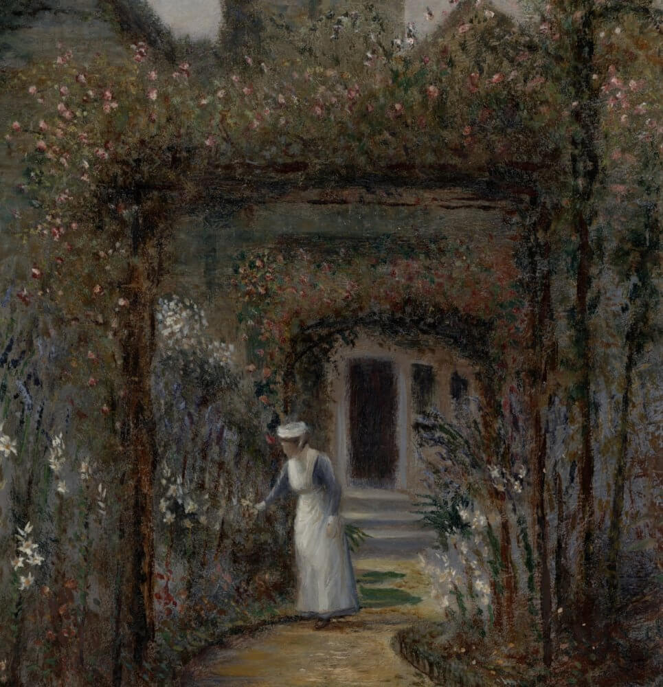
Space – In addressing ‘space’ within a piece of visual artwork, a good starting-point is ‘is the piece two or three-dimensional? From here, it is easier to delve further. Is the work shallow or deep? Open or framed? What kind of perspective is used? How does the artist’s handling of space affect the relationship of the image to viewers? Sister Agnes in the garden of St. John’s Hospital, is incredibly spatial and three-dimensional. Perodean has depicted the garden’s flowers as tall, robust, and completely full of life. They tower over Sister Agnes, who is set back into the composition. The foreground is left quite bare and Perodean creates the illusion of a long, winding pathway towards Sister Agnes through this. In the background, the viewer is able to see a couple of buildings which stand assertively against the sky. However, it is the framing of Sister Agnes which really creates the feel of a spacious and luscious garden.

Medium, Techniques, Size – What materials are used by the artist (what is the medium of the artwork)? Does this affect the style of the artwork? What techniques are used? Is the brushstroke tight or free? Does the brushstroke define boundaries or blur them? What effect does this have on the image? What are the dimensions of the work? Is it minute or large, and does this affect your understanding of the overall work?
Function – By researching a work of arts function, you can consider the relationship between the purpose of the piece and its appearance. How has the image been shaped by its function/purpose? Additionally, you may be able to come to conclusions surrounding the function of the artwork as you work your way through the formal elements of a visual analysis. Looking at the size of the work and its entire subject matter are both key in forming your own interpretation surrounding the function of the piece.
Finally…
Following the points mentioned in this guide will assure a thorough and detailed visual (formal) analysis of any medium of artwork whether that be paintings, sculptures or architecture. It is important when performing a visual analysis to ultimately keep in mind how the artist is shaping the relationship between image and viewer and why he/she has done so. Visual art will readily give you your answers if you just ask yourself the right questions and look closely!
As part of our Collection Focus, there are examples of visual analyses on our website. The first being a visual analysis of George Hilditch’s Richmond Bridge from beneath the Railway Bridge, c.1846. Hilditch’s work is absolutely fascinating when you are able to pick apart each formal element and is a great example of how visual analysis can unveil the artist’s intention and means of execution. You can read the article here and I encourage you all to find an artwork you like from our collection and have a go yourself!
If you would like to know more about art history and visual analysis, check out Dana Arnold’s ‘Art History: A Very Short Introduction’ and, of course, ‘Ways of Seeing’ by John Berger, which is one of the most influential books on art of our time and was adapted from the BBC television series with the same name during the 1970s. The series is available to watch on YouTube.
Madeleine Luxton
Madeleine Luxton, Gallery Volunteer at Orleans House Gallery.
I have recently graduated from the University of East Anglia with a degree in History and History of Art. I am thoroughly enjoying my time exploring the art world and have already become enamoured with one of London’s hidden gems – Orleans House Gallery! Volunteering at Orleans House Gallery has allowed me to meet fellow art enthusiasts and to broaden my passion in helping the art world become much more accessible. My favourite artists are Edouard Manet, Diego Rivera, Robert Rauschenberg and Tracey Emin.
If you’ve enjoyed putting these techniques to use and want to write your own Collection Focus article, why not volunteer with us?
We’ve got a variety of roles, and a wide of range of tasks that support the gallery.
Find out more information and apply here.